Built With Care
A website doesn’t have to be boring. It should be a reflection of the artist, but more than that, an extension of their creative voice. Sometimes, this means building something really specific, like a working computer desktop, a darkroom contact sheet, or an abstract world. This is where we can really get creative and make something unique. Sometimes the best work is displayed simply, but user interface and custom interactions are what stay with the visitor.
The best part is that these builds still run on Squarespace underneath, so your work lives in a normal gallery that you can update yourself easily.
YourWork
Signature Tier
An Extension Of Your Work
Signature builds are designed from scratch around your work. It’s completely custom to you, feels like it’s within your artistic world, and it’s a joy to use.
YourWork
01
Big Interactions
For some work, all you need is a bold statement. Simple, but striking. As you scroll, the photos fly in from every direction and land in a pile. This is a good example of a bold landing page.
See it again ↑02
The archive
For artists with a lot of work spanning a lot of projects, presenting your work like a simple archive is best. In this example, three independently scrolling columns let visitors wander through your archive at their own pace.
hello@yourname.com
Instagram
A short note about you and your work goes here. Where you’re based, what you make, and what you’re working on now.
03
The catalog
For artists who make physical work, like darkroom prints, sculptures, magazines, etc., it’s best to see them catalogued like objects in a collection, with details easy to view.
An archive of photographs, catalogued like objects.
Every item has a number, a title and a record. Select any item to open it.
- Object
- Photograph
- Medium
- Chromogenic print
- Size
- 12 × 14 in.
- Edition
- 1 of 5
- Item
04
The record
For work made with musicians, especially album concept work, having a unique way to view it can change everything. The cover you shot for the album sits up top, and every track on the list has its own photograph from the shoot. Hover over a song to see it.
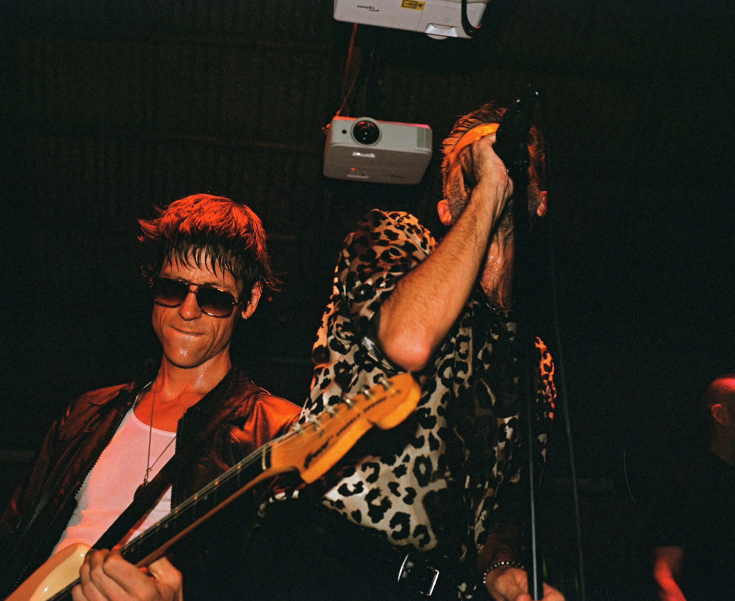
Album Title
Artist Name
A few lines about the shoot: where it happened, what the record sounds like, and how the photographs came together with the music.
- 1Track One3:12
- 2Track Two2:48
- 3Track Three4:05
Unique Tier
Built to play with
Sometimes the site itself is the idea: a working desktop, a map, something visitors play with.
David Lowcher
Film photographer · davidlowcher.com
The brief
Dave wanted his website to feel like the computer he grew up with. A simple design that was interesting but didn’t take away from the work itself.
The build
Now, his site brings you back to the 90s, and showcases his film photographs the right way. The whole site is a working desktop — a realtime clock based on time, a working start menu, and more!
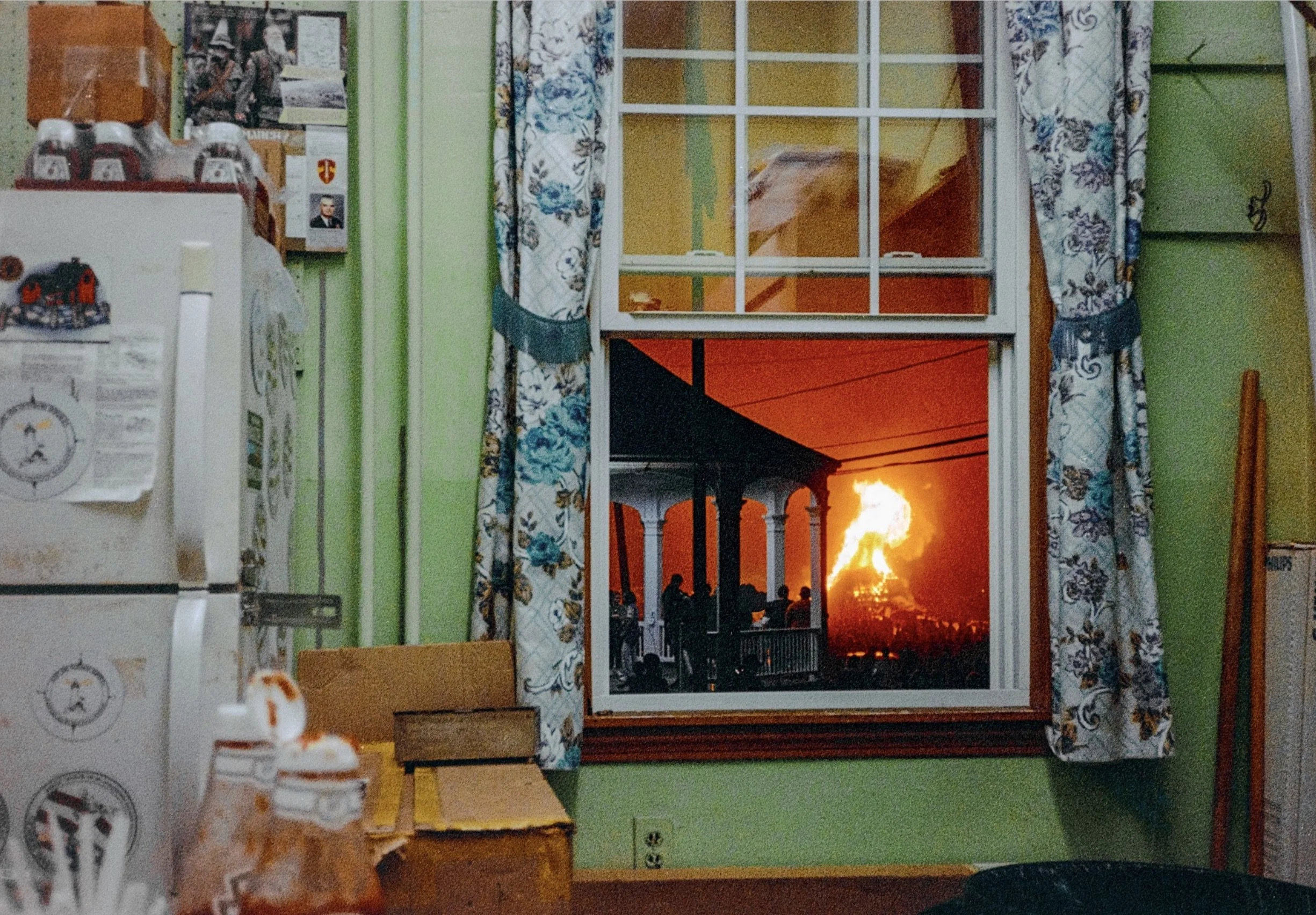
Try it below ↓
Jimmy McAteer
Film photographer · an interactive photo map
The brief
Jimmy wanted his photographs organized the way he remembers them: by place. Not a grid of thumbnails, but the trips themselves.
The build
His site opens on a map of North America, with every state and country he has photographed highlighted. One click switches to the rest of the world, and choosing a place takes you to the photographs made there.
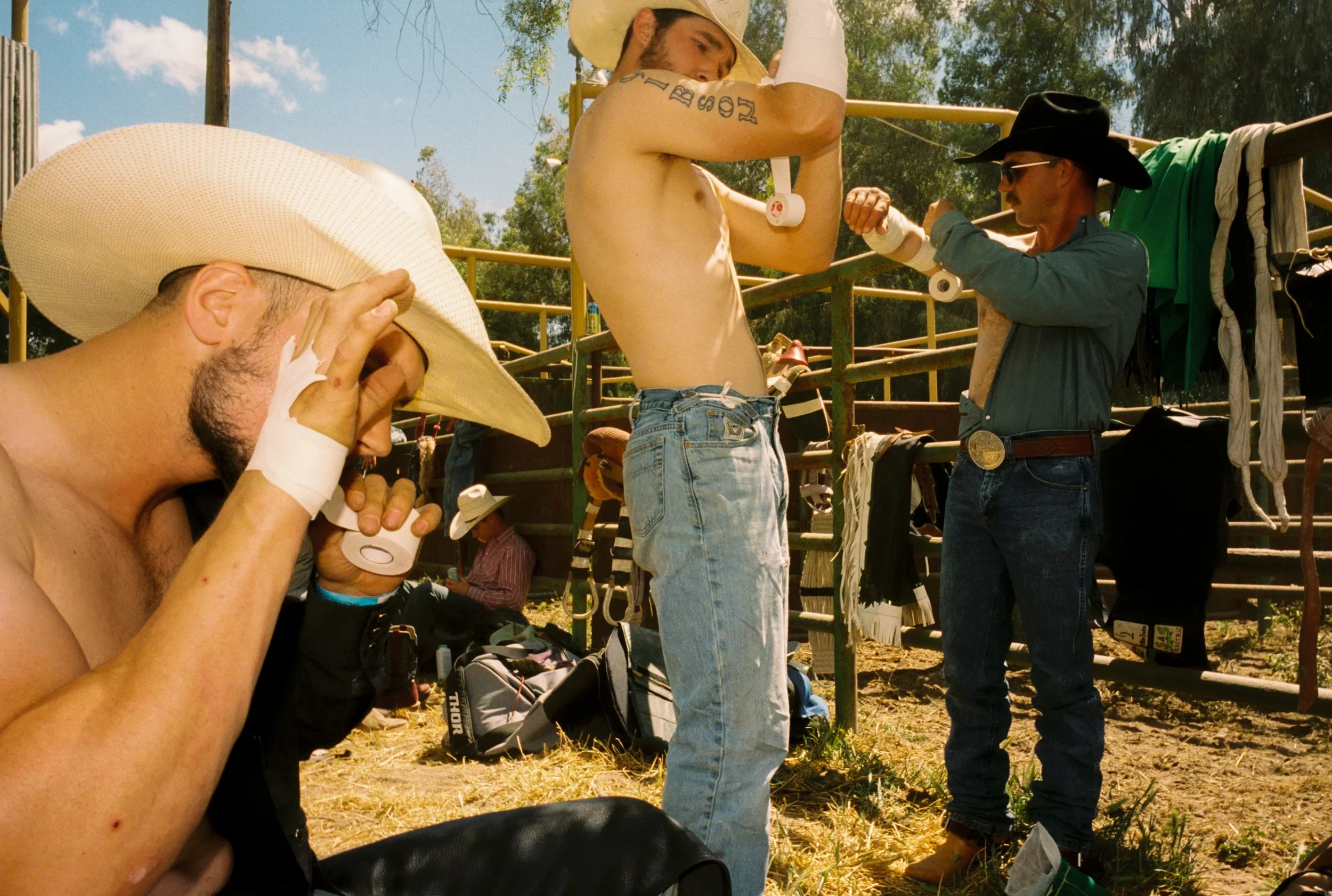
Try it below ↓
Click on California to see his photographs. The other states are turned off in this demo.